

Table of Contents
We’re talking here about ‘ Digital Presence Mistakes ‘ that are avoidable. You’ll lose conversions when your site loads slowly (watch LCP and TTFB), your above-the-fold message is vague, or your mobile UX makes taps and text hard. Broken links, inconsistent CTAs, and confusing navigation bury pricing, services, and contact pages, raising exits. Weak trust signals—stale reviews, missing HTTPS, unclear contact info—lower confidence. High-friction forms and checkout steps spike abandonment; track start-to-submit, errors, and drop-offs, then A/B test fixes. Keep going to see which changes usually win fastest.
Key Takeaways
- Slow pages and heavy media raise bounce rates; optimize images, lazy-load content, and improve Core Web Vitals like LCP and TTFB.
- Confusing above-the-fold design and vague value propositions make visitors leave; simplify layout, clarify outcomes, and add proof fast.
- Poor mobile UX and navigation bury key actions; enlarge tap targets, improve readability, and make pricing/contact easy to find.
- Inconsistent messaging and branding across channels erode trust; align offers, visuals, and tone across your site, profiles, and ads.
- Friction-heavy forms and checkout reduce completions; remove unnecessary fields, enable autofill and inline validation, and show costs early.
Digital Presence Mistakes to Fix First (Impact vs Effort)

If you want the fastest lift in leads and conversions, start by fixing the digital presence mistakes that score high on impact but low on effort—because a few hours of work can often remove the biggest drop-offs in your funnel.
Audit your analytics for high-exit pages, then prioritize fixes you can ship today: tighten tracking (GA4 events, UTMs, form submits), repair broken CTAs and links, and simplify forms by removing nonessential fields.
Next, standardize your messaging and visuals across ads, landing pages, email, and social to protect brand consistency and reduce cognitive friction.
Add Content personalization where it’s easiest: swap hero copy by traffic source, show relevant case studies by industry, and prefill forms for returning users.
Ship changes as A/B tests, measure conversion rate and drop-off, then iterate weekly.
First-Impression Mistakes That Make Visitors Bounce
You lose visitors in the first few seconds when your pages load slowly, your visual hierarchy competes for attention, or your value proposition isn’t immediately clear.
Track time-to-first-byte and Largest Contentful Paint, run a quick 5‑second test on your hero section, and review scroll/click heatmaps to see where confusion starts.
Then A/B test speed fixes, simplify above-the-fold layout, and rewrite your headline so users can instantly answer, “What’s in it for me?”
Slow Load Times
How fast does your site earn trust? If your pages take longer than a couple seconds, you’re bleeding visitors before they read a headline. Page speed shapes first impressions, and delays amplify bounce rates, especially on mobile networks. Don’t guess—measure. Track Core Web Vitals, run Lighthouse, and compare real-user data in analytics against conversion rates by device and location.
Then prioritize load optimization: compress and serve next-gen images, preconnect critical domains, cache aggressively, and reduce render-blocking scripts and CSS. Test each change with A/B or sequential releases so you can attribute gains, not hope for them.
When you cut a second off load time, you don’t just improve metrics—you remove friction that stops intent from becoming action.
Cluttered Visual Hierarchy
Even when your pages load fast, a cluttered visual hierarchy can tank engagement in the first few seconds by forcing visitors to work too hard to find a starting point. When headings, buttons, and banners compete, you create visual clutter and hierarchy confusion, and attention fragments.
Eye-tracking studies show users scan in patterns; if your primary action isn’t visually dominant, they miss it and bounce. Audit above-the-fold elements: reduce competing colors, limit type styles, and give one focal CTA the strongest contrast and most whitespace.
Validate changes with A/B tests on scroll depth, click-through rate, and time to first interaction. Run five-second tests to see what people notice first, and iterate until their gaze lands where you intend on mobile and desktop.
Unclear Value Proposition
A clean visual hierarchy won’t save a homepage that can’t answer one question in under five seconds: “What do I get here, and why should I care?”
When your headline stays vague (“Solutions for modern teams”), the subhead lists features without outcomes, or the CTA says “Learn more,” visitors can’t map your offer to their problem, so they bounce.
Fix it by forcing value clarity above the fold: name the audience, the job-to-be-done, and the measurable result. Keep messaging consistency across headline, subhead, proof, and CTA so each line reinforces the same promise.
Then test: run an A/B on outcome-led headlines, compare scroll depth, time-to-first-click, and demo-start rate. Add specific proof (benchmarks, case metrics, or guarantees) and watch bounce rate fall as intent rises.
Speed Mistakes: Slow Load Times and Bloated Media
Because page speed shapes both user behavior and search visibility, slow load times and bloated media quietly drain your results. When pages take longer than 3 seconds, you increase abandonment and lose qualified clicks before your offer appears.
Heavy hero videos, uncompressed images, and third-party scripts inflate LCP and TTFB, so your conversion funnel starts with friction, not trust.
Audit with Lighthouse and real-user monitoring, then test fixes one by one. Compress to next-gen formats, lazy-load below-the-fold media, and ship smaller bundles with code-splitting.
Cache aggressively and defer noncritical tags. Keep Content personalization lightweight by precomputing variants and limiting client-side rendering.
Track User engagement changes after each deploy: scroll depth, add-to-cart rate, and form starts. Faster pages typically lift revenue per visit and reduce paid-media waste.
Mobile UX Mistakes That Break Tapping and Reading
On mobile, you lose conversions when tap targets are too small, text is too tiny, and key actions sit outside friendly thumb zones. You can confirm it fast: run thumb-reach and tap-accuracy tests, track mis-taps, rage taps, and zoom events, then tie them to drop-offs in your funnel.
Fix the spacing, bump type sizes, and reposition primary buttons, then A/B test to prove you’ve improved tapping and reading.
Tap Targets Too Small
Even if your layout looks clean, undersized tap targets quietly tank mobile UX by driving mis-taps, slowing task completion, and spiking frustration. When buttons, icons, and links sit too close together, you force thumb gymnastics and accidental selections that users interpret as broken design. That user frustration shows up in analytics as higher rage taps, longer time-to-action, and more abandoned carts or forms.
You can catch it fast with session recordings and heatmaps: look for repeated taps on the same element, frequent backtracks, and taps landing on adjacent controls.
Then test fixes with an A/B experiment: increase spacing, enlarge hit areas, and prioritize primary actions above the fold. Validate with reduced mis-tap rate, faster completion time, and improved conversion on mobile.
Text Too Tiny
When your mobile font size drops below comfortable reading range, you don’t just lose aesthetics—you lose comprehension and clicks. Users scan fast; if they must pinch-zoom or squint, they abandon.
Tiny body text also inflates cognitive load and increases misreads of prices, terms, and CTAs, which shows up as higher bounce and lower form completion.
Aim for Typography clarity: set body text around 16px+ with generous line-height and spacing, and avoid ultra-light weights. Pair it with strong color contrast; low-contrast gray-on-white can fail accessibility thresholds and reduce readability in sunlight.
Validate with tests: run A/Bs on font size and contrast, track scroll depth, time-to-first-action, and error rates, and confirm with session replays and on-device QA.
Unfriendly Thumb Zones
Readable text won’t save a mobile experience if your key taps sit outside natural thumb reach. On phones, most users operate one-handed, so placing primary CTAs in the top corners increases missed taps, slows task completion, and drives rage clicks. You can see it in analytics: higher time-to-tap, more “back” events, and drop-offs right before conversion.
Map your interface to thumb zones: keep primary actions in the lower center/right, cluster related controls, and give targets at least 44px with clear spacing.
Then validate with tests: run session replays to spot reach failures, A/B test CTA placement, and track tap accuracy and conversion rate by device size. If the user can’t tap fast, they won’t buy.
Navigation and Layout Mistakes That Hide Key Pages
Because users scan before they click, your navigation and layout can quietly bury the pages that matter most—pricing, services, contact, and key conversion landing pages.
If those links sit behind vague labels, deep dropdowns, or competing CTAs, you’ll push visitors into dead-end browsing instead of next-step action. Fix your menu hierarchy so top tasks stay one tap away, and keep visual consistency so buttons, link styles, and section spacing signal what’s primary.
Use analytics to spot buried pages: high site search usage, repeated backtracking, and low click-through from the header are red flags. Then validate with tests—five-second tests for findability, navigation path analysis, and A/B tests on header labels and order.
Measure time-to-page and conversion lift, not opinions.
Copy and Offer Mistakes That Confuse Buyers
A clean navigation won’t help if the words behind those links make buyers hesitate. When your headline promises speed but your body copy lists caveats, you create friction that shows up as higher bounce and lower add-to-cart rates. Replace vague claims (“best-in-class”) with quantified outcomes, proof points, and clear next steps.
Your offers can also misfire when you lump everyone into one message. Use Customer segmentation to match pain points, objections, and use cases to the right page and CTA.
Audit your Pricing strategy for hidden fees, unclear tiers, and plan names that don’t signal who they’re for. Then test: run A/B experiments on one variable (headline, guarantee, pricing table, CTA) and track conversion, revenue per visitor, and refund rate.
Let results, not opinions, write your copy.
Branding Mismatches Across Site, Google, and Socials

When your site, Google Business Profile, and social profiles tell three different brand stories, buyers hesitate—and that hesitation shows up in measurable drops in click-through rate, branded search conversions, and lead quality.
If your logo, colors, tone, or value prop shift by channel, you create friction at the exact moment people verify you.
Audit your top entry points: homepage, GBP, LinkedIn/Instagram, and your most-viewed landing page. Compare profile images, headers, bio lines, and primary CTA.
Then run a two-week test: align naming, tagline, and offer framing, and standardize design tokens for visual harmony.
Track CTR from branded queries, engagement-to-click rate on social, and form-start rate.
You’ll see how branding consistency reduces confusion and improves intent-qualified traffic.
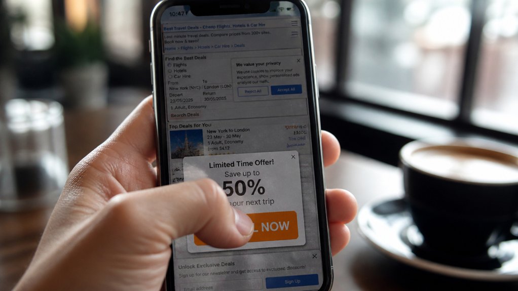
Trust-Signal Mistakes: Reviews, Security, and Contact Info
Even if your positioning is strong, weak trust signals can tank conversions faster than a bad headline. If your star ratings look stale, users assume your service is, too. Treat review management like a growth lever: respond within 24–48 hours, fix patterns you see in complaints, and track rating velocity, not just averages.
Security cues matter, especially on mobile. If your site lacks HTTPS, shows mixed-content warnings, or hides privacy and refund policies, you’re forcing doubt. Test trust badges near decision points, but don’t overdo them—measure scroll depth and click-through to key pages.
Finally, make contact info effortless: consistent NAP, a real address, hours, and a working phone number. Run monthly audits and A/B tests to confirm lifts.
Form and Checkout Mistakes (Plus What to Track Next)
Because every extra field adds friction, your forms and checkout flow often decide whether users convert or bounce. Audit each step: remove optional fields, enable autofill, and show inline validation so errors don’t appear after submission. Offer guest checkout, transparent shipping costs early, and multiple payment options; these are proven checkout optimization levers.
Next, track where users stall. Measure form-start to form-submit rate, error rate by field, time to complete, and abandonment by step. Segment by device, browser, and traffic source to spot UX debt. Use session replays and heatmaps to confirm hypotheses, then A/B test one change at a time.
Pair quantitative data with Customer feedback from post-abandon surveys to learn why they quit and what would have saved the sale.
Frequently Asked Questions
How Do I Calculate Conversion Rate Benchmarks for My Industry?
Calculate industry conversion-rate benchmarks by defining your funnel (visit→lead, lead→sale), then pulling peer data from analytics tools, trade reports, and your ad platforms.
Segment by channel, device, and audience so you don’t average away signal.
Normalize for offer and traffic quality, then compare median and top-quartile rates.
Run A/B tests to validate lift.
Track user experience and branding consistency, since both shift baseline rates.
Which Analytics Tools Best Attribute Conversions Across Multiple Touchpoints?
You’re closer than you think—but one hidden touchpoint can steal the credit. Start with Google Analytics 4 for cross-channel reporting and Attribution models.
Then add Adobe Analytics if you need enterprise depth. Use HubSpot or Salesforce for CRM-linked journeys, and Mixpanel or Amplitude for product funnels.
You’ll win by running experiments: compare models, validate with lift tests, and apply Data segmentation to isolate channels, audiences, and devices.
When Should I Hire a CRO Specialist Versus Redesigning My Website?
Hire a CRO specialist when your traffic is steady, your offer’s clear, and you need to lift conversions through A/B testing and User journey mapping rather than new visuals. You’ll get faster wins by diagnosing leaks in funnels, forms, messaging, and checkout.
Redesign when usability is broken, mobile performance lags, branding is outdated, or the CMS blocks iteration. If you can’t test quickly, a redesign enables ongoing optimization.
How Long Does It Typically Take to See Conversion Improvements After Fixes?
You’ll typically see conversion improvements in 2–6 weeks after fixes; faster (7–14 days) for tracking, speed, and UX friction, slower (6–12 weeks) for messaging and funnel changes.
Test, learn, iterate: that’s your rhythm.
You’ll watch User engagement metrics (bounce rate, scroll depth, click-through) and validate Content relevance via A/B tests.
Expect small lifts first, then compounding gains as you scale winners across pages.
What Legal Compliance Issues Can Reduce Conversions (Gdpr, ADA, Cookie Consent)?
Legal compliance gaps reduce conversions when you collect data without clear consent, block access for users with disabilities, or confuse visitors with opaque notices.
Under Privacy regulations like GDPR, you must offer lawful bases, easy opt-outs, and transparent policies; violations trigger trust loss and abandonment.
If you miss ADA/WCAG basics (keyboard nav, alt text, contrast), you exclude buyers.
Test cookie banners, consent rates, and accessibility scans; A/B fixes and track funnel drops.
Conclusion
You’ve seen how small digital presence mistakes quietly kill conversions. Here’s the wake-up stat: Google found that when page load time jumps from 1 to 3 seconds, bounce probability rises 32%. That’s traffic you already paid for. Fix the highest-impact issues first—speed, mobile UX, clarity, and trust signals—then validate every change with A/B tests and funnel tracking. Don’t guess. Measure clicks, scroll depth, form starts, and completions, and iterate weekly for compounding gains.