

Table of Contents
When someone chooses to visit your website, they have an expectation. Clients decide in seconds if they trust you, so your header, hero headline, and main CTA must instantly explain what you do and what to do next. If your site feels slow on mobile (over 2–3 seconds), they’ll bounce and assume you’re unreliable. They also scan for modern design cues, clear typography, and easy navigation. Near the first scroll, they want proof—logos, testimonials, metrics, and credentials. Keep going to see exactly what to fix first.
Key Takeaways
- They judge trust in seconds from your header, hero message, and brand consistency.
- They notice speed and mobile usability; slow load times or clunky layouts signal incompetence.
- They look for instant clarity on what you do and who it’s for, without jargon.
- They seek proof near the top—testimonials, client logos, credentials, and measurable results.
- They follow clear next steps; prominent, specific CTAs and short forms reduce friction and increase inquiries.
What’s the First Thing Clients Notice on Your Website?
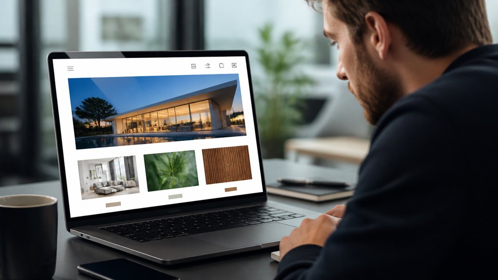
When someone lands on your site, they decide within seconds whether it feels trustworthy and relevant. Your header, hero message, and primary call-to-action get seen first, so make them do the heavy lifting. Put the clearest value proposition in the top-left/center, keep the next step obvious, and trim competing links.
Strong visual hierarchy guides the eye from headline to proof to action. Use size, contrast, and spacing so clients don’t have to hunt. Then reinforce confidence with brand consistency: the same logo treatment, colors, typography, and voice across pages.
Consistency reduces friction and signals professionalism, which lowers bounce risk. Finally, show quick proof—client logos, a short testimonial, or a metric—near the first scroll so you answer “Can you help me?” fast.
Does Your Website Load Fast on Mobile?
Because most clients reach you from a phone, your mobile load time directly affects trust, engagement, and conversions. When your site stalls, visitors bounce before they scroll, and you lose leads you already paid to attract.
Aim for a fast first view: compress images, ship less JavaScript, and enable caching so pages render quickly on cellular connections. Prioritize mobile optimization: use responsive layouts, modern image formats, and defer noncritical scripts.
Track page speed with Core Web Vitals and real-user monitoring, not guesses. A good target is under 2–3 seconds on 4G, with stable layout and quick input response.
Test on midrange Android devices, not just your desktop. Speed feels like competence, and clients notice it immediately.
Can Clients Understand What You Do in 5 Seconds?
Even if your design looks polished, clients won’t stick around if they can’t tell what you do in the first five seconds. You need a clear headline that states the outcome you deliver, who it’s for, and where you work.
Pair it with one focused call to action. Studies on web scanning show people read in fragments, so branding clarity beats clever taglines.
Use visual hierarchy to guide the eye: headline first, supporting proof second, action third.
Replace jargon with plain language and concrete nouns.
Add trust cues near the top—client logos, a short result, or one testimonial line—so visitors confirm they’re in the right place.
Then test it: show your homepage for five seconds and ask, “What do we do?”
Does Your Website Design Look Modern or Outdated?
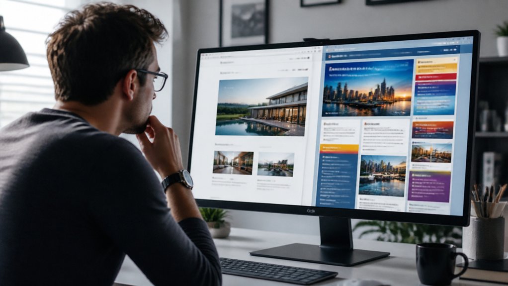
After clients grasp what you do, they quickly judge whether your site feels current or dated, and that snap impression shapes trust.
You’ll look modern when you use contemporary visual trends like clean typography, generous spacing, strong contrast, and consistent components that make scanning effortless.
You’ll look outdated when you rely on cluttered layouts, tiny text, stock-heavy hero sliders, or mismatched colors—signals that can raise doubts before anyone reads a word.
Contemporary Visual Trends
When a client lands on your site, the visual style signals “current” or “dated” in seconds, and that snap judgment shapes how credible you seem before they read a word. Contemporary trends help you earn trust by reducing friction and spotlighting value fast.
You’ll see better engagement when you use Minimalist aesthetics: generous white space, clear hierarchy, and fewer competing elements that let key actions stand out. Pair that with bold typography to guide scanning—users typically skim first, so strong headings and readable body text improve comprehension.
Use modern, high-contrast color palettes that meet WCAG, and choose inclusive imagery that reflects your audience. Add subtle motion only when it clarifies intent, like hover states or progress cues, and keep it performant so pages load quickly on mobile.
Signs Of Aging Design
Although your content may still be strong, outdated design cues can lower perceived trust and conversion in a few seconds because visitors often judge credibility before they read.
If your pages rely on Vintage fonts, heavy shadows, or outdated color schemes, clients may assume your business also lags behind.
Watch for cluttered layouts, tiny text, low contrast, and buttons that don’t look clickable; these patterns hurt accessibility and increase bounce rates.
Check your site on mobile: slow loads, fixed-width sections, and cramped tap targets signal neglect and frustrate busy buyers.
Compare your interface to modern benchmarks—clean typography, consistent spacing, and clear hierarchy.
Run a quick audit: Core Web Vitals, contrast checks, and a five-second test to see what people remember.
What Trust Proof Do Clients Look for on Your Website?
You earn trust fast when you make your credentials easy to verify—licenses, certifications, and relevant results shouldn’t be buried.
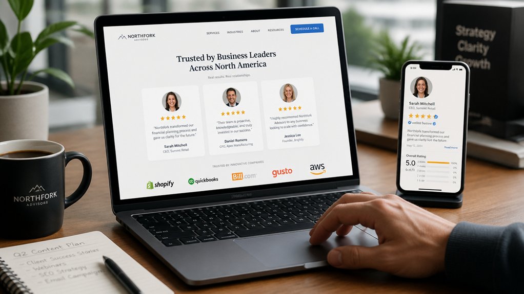
You also need strong social proof, like specific testimonials, recognizable client logos, and review ratings that show consistent outcomes.
Finally, you reduce hesitation when your contact options feel secure, with HTTPS, clear privacy cues, and trusted payment or form protections.
Clear Credentials Displayed
Before a visitor reads your service details, they scan for credibility signals that answer one question fast: “Can I trust this business?” Clear, easy-to-verify credentials—licenses, certifications, awards, insurance, and recognizable partner logos—reduce perceived risk and shorten the decision cycle.
Make credentials impossible to miss. Place them near primary actions (Contact, Book, Get a Quote) and on key pages, not buried in a footer.
Use visual hierarchy: group badges in a single row, label them (“Licensed in CA #12345”), and link to verification pages when possible.
Keep brand consistency by using uniform badge sizes, spacing, and color treatment so the section feels intentional, not cluttered.
Update dates, coverage limits, and certification statuses. Outdated or vague claims raise doubt quickly and drive exits.
Strong Social Proof Signals
When a new visitor lands on your site, they look for social proof that confirms real people like them got real results. You earn trust fastest when proof is specific, recent, and easy to verify at a glance.
Place client testimonials near the services they reference, and include concrete outcomes: timelines, measurable lifts, cost savings, or before-and-after metrics. Add names, roles, photos, and company logos when permitted, since attribution increases credibility.
Balance glowing quotes with a few nuanced details (“what changed,” “why you were chosen”) to sound authentic. Highlight industry awards with the awarding body, year, and category, and link to press mentions or case studies that explain criteria.
Consistent proof across pages reduces doubt and shortens decision time for high-intent visitors.
Secure Contact Options
How securely can a visitor reach you without risking their personal information? Clients scan for a secure contact path the moment they’re ready to ask about pricing, timelines, or sensitive details.
If your forms load over HTTPS, display clear privacy language, and use spam protection without invasive tracking, you lower friction and boost confidence.
Add visible options like encrypted email, a secure client portal, and verified phone numbers so people can choose their comfort level.
Show security cues: SSL indicators, consent checkboxes, and brief notes on how you store messages.
Fast responses matter too; even a 24-hour promise signals reliability.
When you offer trusted communication, you don’t just look professional—you feel safe, and that’s what converts.
Which Calls-to-Action on Your Website Get Clicks?
Although your site might look polished, clients judge it by what they can do next—and your calls-to-action (CTAs) are the most measurable proof. You’ll get more clicks when you pair effective CTA placement with persuasive CTA language that matches intent.
Put one primary CTA above the fold, repeat it after key benefits, and keep it near pricing, case studies, and contact options. Use buttons with high contrast and generous padding so they’re easy to tap on mobile.
Replace vague “Submit” with action-plus-outcome: “Get a Quote,” “Book a 15‑Minute Call,” or “See Pricing.” Reduce friction with short forms, clear privacy cues, and fast pages.
Then A/B test one change at a time and track click-through rate, scroll depth, and conversions.
Frequently Asked Questions
Do Visitors Care More About Images or Written Content?
Visitors care about both, but images win first while written content seals trust. You’ll grab attention through visual impact in seconds. Yet you’ll lose conversions if content clarity isn’t immediate.
Data shows users scan headlines, captions, and calls to action before committing. So you should pair strong visuals with concise, benefit-led copy. If you can’t explain value fast, pretty photos won’t help you convert visitors.
How Often Should I Update My Website Content?
Update key pages every 1–3 months, and refresh blogs or news weekly if you can. Think of your site like a garden: steady watering beats flood-and-forget.
Track Content freshness with analytics—watch organic traffic, time on page, and conversions—then set your Update frequency to match what performs. Update faster when offers change, products launch, or FAQs spike.
If nothing’s changed, polish titles, add examples, and fix broken links.
What Pages Are Essential for a Service Business Website?
You’ll need a clear Home page, dedicated service landing pages, an About page, and a Contact page with prominent contact details.
Add Pricing or “Request a Quote” to cut drop-offs, plus Testimonials/Case Studies to boost conversions.
Include FAQs to reduce support questions and a Blog/Resources page if you want organic traffic growth.
Don’t forget a Privacy Policy and Terms, since compliance builds trust and reduces risk.
Should My Website Include a Blog for Better Credibility?
Yes—you should include a blog if you can publish consistently and tie posts to your services. A blog strengthens credibility by showing expertise, answering real client questions, and supporting your Content Strategy with searchable, helpful content.
You’ll also boost User Engagement by giving visitors reasons to return and share. Track results with analytics: traffic, time on page, leads, and conversions.
If you can’t maintain quality, skip it.
How Can I Track What Visitors Do on My Website?
You can track what visitors do by installing an analytics tool (like GA4) and a heatmap recorder. Coincidentally, the first clicks you review often reveal your biggest UX gaps.
Set up events for key actions, then monitor user behavior through paths, scroll depth, and session replays.
Tie everything to conversion metrics like form submits, calls, and purchases. You’ll spot drop-offs fast, test fixes, and measure wins objectively.
Conclusion
When clients land on your website, they’ll judge it fast: speed, clarity, and credibility. If your mobile load lags, you lose visitors—data shows most users bounce after just a few seconds. Make your message unmistakable in five seconds, keep your design clean and current, and showcase proof that builds belief (reviews, results, reputable logos). Then guide them with a single, standout CTA. Fast, focused, and friction-free wins.