
Table of Contents
It’s usually one of two things that suggests your website needs a refresh. A noticeable drop of online orders, despiite traffic numbers still high OR, a friendly word in your ear from someone you trust and know really well.
You need a website refresh if your header feels unclear (logo looks soft, nav labels confuse, your main button hides), your visuals don’t match (fonts, icons, spacing, colors), or your hero lacks a sharp headline and crisp image. Watch for dated gradients, heavy shadows, low-res stock photos, and cramped layouts. If pages load slowly, break on mobile, or taps misfire, it’s time. If your copy feels vague and CTAs disappear, keep going to spot the fixes. A great website, improves your digital presence and attracts visitors.
Key Takeaways
- Your site looks dated: inconsistent colors, heavy shadows/gradients, too many fonts, low-res imagery, or cramped layouts.
- Navigation feels confusing: competing buttons, unclear categories, inconsistent headers, or users struggle to find the next step.
- It’s slow or not mobile-friendly: long load times, broken layouts on phones, tiny tap targets, or janky scrolling and forms.
- Your message and CTAs underperform: vague headline, feature-only copy, hidden buttons, or high traffic with low clicks and form starts.
- Brand and visuals lack consistency: mismatched tone, fonts, icons, and spacing across pages, making the experience feel improvised.
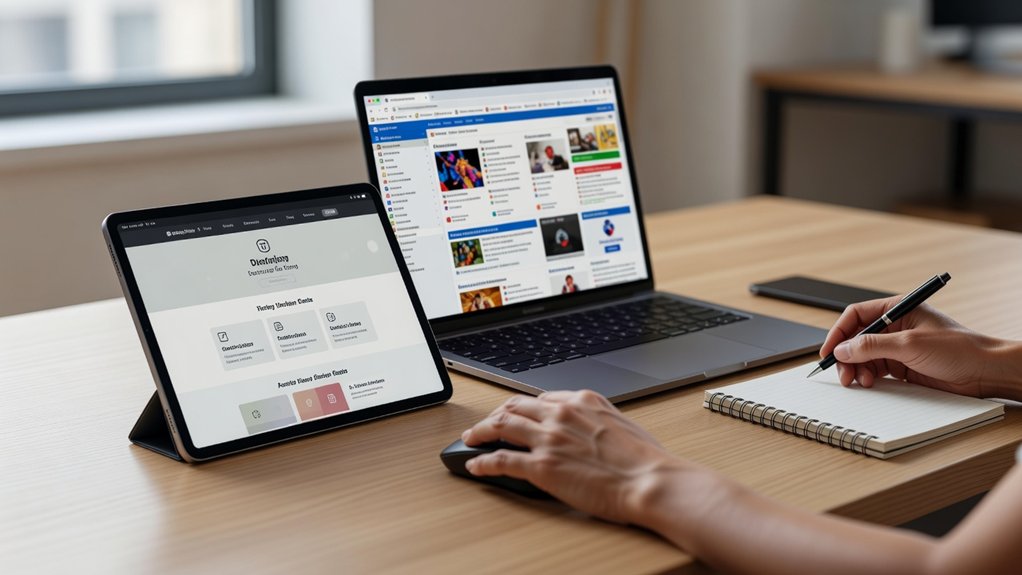
60-Second Website Refresh Checklist (Quick Wins)
If you’ve only got a minute, you can still spot the fastest “refresh” wins by scanning what visitors see first. Check your header: logo crisp, navigation labels clear, and your primary button stands out. Confirm visual consistency: one font pairing, consistent icon style, and predictable spacing between sections.
Next, scan the hero area. Make sure the headline states the value in one breath, and the supporting image looks sharp on retina screens. Verify branding alignment: your brand colors match across buttons, links, and highlights, and your tone matches the audience.
Glance at mobile: tap targets feel roomy and the top CTA stays visible. Finally, run a quick page-speed check; compress the largest image and remove one heavy plugin or script.
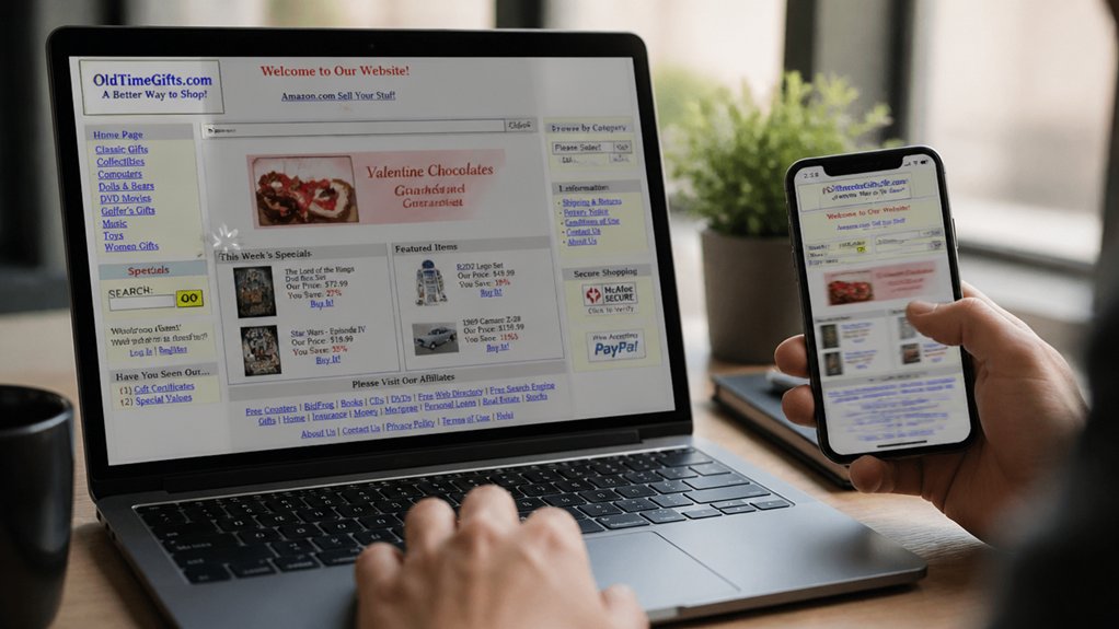
Signs Your Website Design Feels Outdated
Even when your content’s solid, an outdated design shows up in the first few seconds—through visuals that feel “off” rather than obviously broken. If your color scheme leans muddy, overly neon, or mismatched across pages, visitors sense it’s been untouched for years. Out-of-date gradients, heavy drop shadows, and busy backgrounds can make everything look noisy and cheap.
Your font choices also signal age. If you’re mixing too many typefaces, relying on thin, low-contrast text, or using dated display fonts, reading feels harder than it should. Stocky icons, low-res imagery, and inconsistent spacing add friction fast.
When buttons, cards, and headings don’t share a clear style, your brand looks improvised. If your layout doesn’t breathe on modern screens, it’s time for a refresh.
Signs Your Website Navigation Confuses Visitors
Look at your visual hierarchy: does one clear primary path stand out, or do competing buttons, mismatched colors, and inconsistent placement fight for attention?
If your header changes between pages, breadcrumbs disappear, or the search bar is buried, your User experience takes the hit.
Streamline categories, use plain-language labels, and keep calls-to-action consistent so visitors move with confidence.
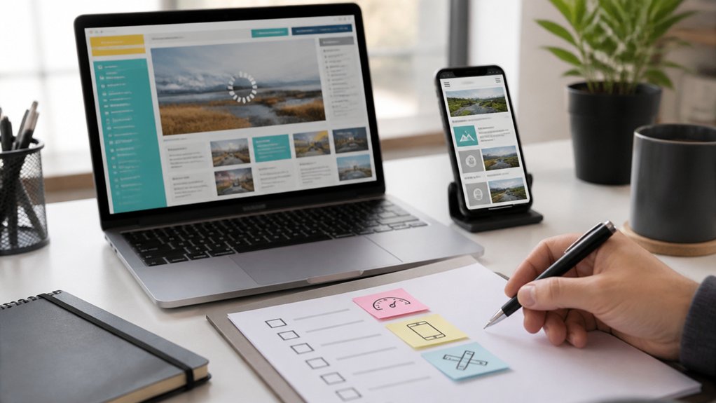
Signs Your Website Is Slow or Not Mobile-Friendly
When your pages drag to load or break on a phone screen, visitors feel it immediately—taps don’t register, text shrinks, images jump around, and menus turn into tiny, hard-to-hit targets. If you see high bounce rates from mobile or hear “it won’t load,” your site’s speed and responsiveness need help.
Watch for oversized hero images, background videos, and heavy scripts that stall above-the-fold content. On phones, check whether your color scheme loses contrast in sunlight, buttons sit too close, and your font choices render thin or cramped.
If pages stutter while scrolling, forms lag, or pop-ups cover the screen, you’re forcing extra effort. A refreshed site loads fast, keeps layouts stable, and adapts touch-first, thumb-friendly spacing.
Signs Your Website Copy and CTAs Don’t Convert
A fast, mobile-friendly site only gets you to the starting line—your copy and CTAs still have to earn the click. If visitors skim, hesitate, or bounce after reading, your message isn’t landing.
Watch for vague headlines, feature lists without benefits, and paragraphs that look like gray walls. When your value isn’t clear in five seconds, Content clarity is off.
Your buttons can also betray you. “Submit” or “Learn More” fades into the background, especially when it’s small, low-contrast, or buried below the fold.
If heatmaps show rage clicks, or analytics show lots of page views but few form starts, Call to action effectiveness is weak.
Tighten the promise, show proof, and make one next step impossible to miss.
Frequently Asked Questions
How Often Should I Refresh My Website Design Without a Full Redesign?
You should refresh your website design every 6–12 months without a full redesign. Update colors, typography, spacing, and imagery to maintain visual consistency while keeping your structure intact.
Review heatmaps and analytics quarterly, then tweak navigation labels, button contrast, and key page layouts to lift user engagement.
Swap outdated screenshots, refine icon styles, and modernize micro-interactions.
If performance or conversions dip, schedule a focused refresh sooner rather than later.
What’s the Typical Cost Range for a Website Refresh?
Is your budget ready? You’ll typically pay $1,500–$15,000 for a website refresh, depending on pages, complexity, and who builds it.
If you update visual branding (colors, typography, imagery), expect $2,500–$8,000.
If you also refine layouts, mobile UI, accessibility, and performance for better user engagement, budget $5,000–$15,000.
Add copywriting, new photography, or CMS tweaks, and costs climb quickly.
How Long Does a Website Refresh Usually Take to Complete?
A website refresh usually takes 2–8 weeks, depending on scope and approvals.
If you’re updating visuals, layout, and copy while keeping the same platform, you’ll often finish in 2–4 weeks.
If you’re improving website performance, refining navigation, and testing user experience across devices, plan for 4–8 weeks.
You’ll move faster when you deliver assets early, give consolidated feedback, and keep stakeholders aligned throughout each sprint.
Will a Website Refresh Hurt My SEO or Rankings Temporarily?
Yes, a refresh can nudge your SEO or rankings temporarily—ironically, the makeover meant to shine can cast a short shadow. You’ll minimize dips by keeping URLs stable, preserving metadata, and using 301s when pages move.
Improve Content freshness with updated copy and structured headings, and protect User engagement with fast load times, clear navigation, and mobile-friendly layouts.
Monitor Search Console, fix crawl errors quickly, and you’ll usually rebound stronger.
Should I Refresh My Website In-House or Hire an Agency?
You should refresh in-house if you’ve got skilled designers/developers, time for QA, and clear goals for branding consistency and user experience.
You should hire an agency if you need strategy, custom UX/UI, or faster execution with fewer missteps.
If your pages need new layouts, tighter typography, and polished visuals across devices, an agency helps.
If it’s mostly content updates and small component tweaks, you can handle it.
Conclusion
If your website feels like a storefront with faded paint and a sticky door, it’s time to refresh. You’ve checked the quick wins, spotted dated design cues, confusing menus, sluggish load times, and mobile hiccups. You’ve seen copy that drifts instead of guiding, and CTAs that whisper instead of invite. Now picture a cleaner layout, faster pages, and clearer paths—like fresh signage under bright lights—so visitors glide, click, and convert.