

Table of Contents
Your website should reflect your business properly because visitors decide in seconds whether you’re credible, a fit, and worth contacting. When your design, voice, and offers match how you actually deliver—pricing logic, process steps, response times, and outcomes—you reduce confusion and help qualified buyers self-select. Back up claims with measurable proof like case studies and testimonials tied to results. Consistency across pages boosts trust, conversions, and lead quality. Next, you’ll see how to spot and fix misalignment fast.
Key Takeaways
- It communicates who you are, what you do, and why you’re the right choice within seconds.
- Consistent design and tone build trust, signaling quality and credibility instead of “low investment.”
- Clear messaging, proof, and differentiators help visitors self-qualify, improving lead quality and conversions.
- UX aligned with your real process sets accurate expectations for pricing, timelines, and next steps.
- Audience-aligned content reduces confusion, lowers bounce rates, and guides users smoothly from entry to action.
What It Means to Reflect Your Business?

Every page on your website should signal who you are, what you do, and why you’re the right choice—within seconds. To reflect your business, you translate your real value into measurable cues: positioning, proof, and path to action.
You align messaging with your offer structure, pricing logic, and client outcomes, so visitors don’t guess what you deliver. You mirror how you work—response times, process steps, and expectations—so leads self-qualify and conversion rates rise.
You back claims with data: testimonials tied to results, case studies with metrics, and clear differentiators. You protect business authenticity by matching tone, visuals, and promises to what clients experience.
You preserve brand integrity by staying consistent across pages, CTAs, and content priorities.
Quick Signs Your Website Feels “Off
You can spot a website that feels “off” when your branding looks inconsistent across pages, eroding trust in seconds.
If your navigation forces visitors to think too hard, you’ll see it in higher bounce rates and fewer conversions.
And when your content reads outdated, you’re signaling that your business may be, too, costing you qualified leads.
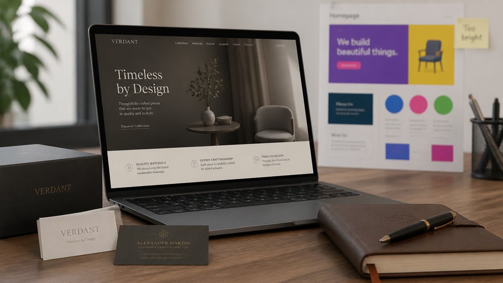
Branding Feels Inconsistent
Although your pages may look polished in isolation, inconsistent branding makes the site feel “off” the moment visitors move from one section to another. When colors shift, typography changes, or imagery styles clash, you signal “multiple companies,” not one credible partner. That fractures trust fast and raises perceived risk, which can depress conversions even if your offer is strong.
Audit your branding consistency across headers, buttons, icons, photography, and tone of voice. If your logo lockups vary, CTAs look like they come from different templates, or your copy swings from formal to casual, prospects hesitate.
Build visual harmony with a defined type scale, a limited color system, and reusable components. Then measure impact: track time on page, form starts, and demo requests before and after standardization.
Navigation Creates Confusion
When navigation lacks a clear hierarchy, visitors burn cognitive budget just trying to orient themselves instead of evaluating your offer. If your menu labels overlap, categories sprawl, or key pages hide behind vague wording, you create user confusion that looks like low intent but is really poor routing.
You’ll see it in analytics: high bounce rates on landing pages, short sessions, and repeated backtracking between the same URLs. You also hear it in sales calls when prospects ask basic “Where do I find…?” questions.
Fix it by enforcing navigation clarity: limit top-level choices, use plain-language labels, and align paths to your primary buyer tasks. Then validate with click-path reports and task-based testing, so your structure matches how clients decide today.
Content Seems Outdated
Even if your design still looks modern, stale content quietly signals neglect and erodes trust before prospects ever reach your pricing page. When your last blog post is two years old, your “news” mentions past events, or your team bios don’t match LinkedIn, buyers assume your service is equally behind.
You can’t rely on timeless design alone; credibility comes from freshness and proof. Audit your pages quarterly: update dates, refresh case studies with measurable outcomes, and align offers with current trends in your market. Replace vague claims with specific metrics, recent client logos, and updated FAQs that address today’s objections.
If you publish content, commit to a cadence you can sustain—one strong post a month beats a burst-and-ghost strategy. Keep every page accurate, relevant, and conversion-ready.
Start With Who Your Website Is For
You can’t fix a website that feels “off” until you define exactly who it’s built for and what success looks like for them.
Start by clarifying your ideal audience, then map their top questions, objections, and next-step intent across each key page.
Use that insight to tailor your content and design so every element guides the right visitors to act.
Define Your Ideal Audience
Before you tweak layouts or polish copy, define exactly who your website serves and what they need to do there. Start with real data: CRM tags, sales calls, support tickets, and analytics that show where leads come from and why deals close.
Use audience segmentation to separate high-value buyers from browsers, and quantify each group’s revenue potential, sales cycle, and retention. Then sharpen market targeting by choosing the segments you can win based on differentiation, pricing fit, and service capacity.
Turn those choices into clear audience profiles: industry, role, urgency, budget, objections, and decision authority. When you know who you’re speaking to, you’ll stop designing for everyone and start building credibility with the people most likely to buy.
This alignment improves conversion rates and reduces acquisition costs considerably.
Map Visitor Needs
Where do visitors hesitate, backtrack, or bounce on their path to a decision? You can’t guess—you map it.
Start by defining the few primary tasks they’re trying to complete: compare options, validate trust, understand pricing, or contact you. Then chart the steps they take from entry pages to conversion actions, noting common questions and objections at each stage.
Use analytics to confirm patterns in visitor behavior: top landing pages, exit points, search terms, device split, and time-to-action. Pair that with heatmaps, scroll depth, and session recordings to quantify friction and measure user engagement.
Finally, align internal stakeholders on what “success” looks like per journey so you can prioritize fixes by impact, not opinion or hunch.
Tailor Content And Design
Although analytics can reveal how visitors move through your site, content and design only convert when they’re built for the specific people you need to serve.
Start by defining your primary segments: industry, role, urgency, objections, and desired outcomes. Then align your homepage message, navigation, and CTAs to the top tasks each segment expects to complete.
Use Content personalization to surface the most relevant proof—case studies, pricing cues, and FAQs—based on intent signals like page path, campaign source, or location.
Apply Color psychology to support decisions: high-contrast buttons for priority actions, calming palettes for trust, and consistent accents for recognition.
Validate changes with A/B tests tied to revenue metrics: qualified leads, demo requests, and conversion rate by segment.
Match Website Design to Your Brand Quality
If your website’s design doesn’t reflect the quality of your brand, you’re forcing prospects to question your credibility before they ever talk to you. People judge value fast: users form impressions in milliseconds, and those impressions shape whether they stay, scroll, or bounce.
When your visuals look dated, inconsistent, or generic, you signal “low investment,” even if your service is premium.
Match your design to your real-world experience. Use Brand consistency across typography, color, spacing, and imagery so every page reinforces the same promise. Build Visual harmony with clear hierarchy, readable layouts, and intentional whitespace that guides attention to key actions.
Align interaction quality, too—speed, accessibility, and mobile polish. When your design feels as strong as your offer, you reduce friction, increase trust, and improve conversion rates.
Make Your Website Copy Sound Like You
Your copy should sound like you because voice consistency builds trust and moves visitors toward action. Define your brand voice with clear attributes (e.g., direct, expert, friendly) and validate it against engagement data like time on page, scroll depth, and conversion rate.
Then write in natural, consistent language across every page so clients instantly know what you stand for and what to do next.
Define Your Brand Voice
How does your website sound when someone lands on it for the first time—confident expert, warm guide, or generic template? That first impression sets expectations and shapes whether visitors trust you enough to click, call, or buy.
When your voice matches your strengths, your message reads as credible and intentional, not accidental.
Define your Brand personality in plain terms: who you serve, what you believe, and how you lead clients to outcomes. Then translate it into rules you can enforce: preferred words, phrases to avoid, sentence length, and the level of formality.
Keep Tone consistency across pages so visitors don’t feel a disconnect between your homepage promise and your service details.
Track engagement and conversion rates after updates to confirm your voice is working, not just sounding good today.
Use Natural, Consistent Language
Although polished copy can look impressive on the surface, visitors trust language that sounds like a real person with a clear point of view. If your pages shift from formal to casual, you create friction and lose conversions. Keep sentences short, choose familiar words, and mirror how you explain your work on calls.
Then standardize terms for offers, outcomes, and next steps so every page reinforces the same promise.
Use analytics to validate tone: track bounce rate, scroll depth, and CTA clicks before and after revisions. Align language with website aesthetics and color psychology, so what you say matches what people feel.
For example, confident verbs pair with bold palettes; calming guidance fits softer tones. Consistency builds recognition, reduces doubt, and makes your brand instantly believable. Across every touchpoint.
Set Clear Expectations Before They Contact You
Before a visitor ever hits “Contact,” clear website messaging sets the terms of engagement and filters out mismatched leads. Spell out who you serve, what you deliver, typical timelines, and starting price ranges so prospects self-qualify.
When you publish Service transparency—what’s included, what isn’t, and your process—you reduce back-and-forth and increase close rates because calls start at the right level.
Use Customer feedback to validate expectations: quote recurring outcomes, common objections you’ve solved, and measurable results clients report.
Add clear next steps (required info, response time, consult length) and criteria for fit. You’ll cut low-intent inquiries, improve lead quality, and protect your team’s time while boosting trust.
Align Website UX With How You Actually Serve
When your website UX mirrors the way you actually deliver work, you’ll move qualified visitors from curiosity to commitment with less friction. Map each page to your real client journey: discovery, scope, timeline, pricing range, and next steps.
If you onboard with a questionnaire, place it before scheduling. If you consult first, make booking primary and remove distracting CTAs.
Use Color psychology to signal intent—calm tones for guidance, high-contrast accents for decisions—so users don’t guess where to go.
Validate choices with User feedback: session recordings, form-drop data, and quick post-visit polls. Then iterate monthly, prioritizing the steps that reduce time-to-contact and increase completion rates without adding more pages.
Keep navigation simple and mobile-first always.
Show Proof People Can Trust on Your Website

The fastest way to increase qualified inquiries is to make trust visible at a glance. When visitors can verify you’re legitimate in seconds, bounce rates drop and engagement rises. Add Trust signals where decisions happen: above the fold, on service pages, and near pricing.
Use credibility boosters that match how you sell. Publish quantified outcomes (time saved, ROI, defect rate reduction), named client logos you’re allowed to use, and short testimonials tied to specific deliverables. Include case studies with before/after metrics and your exact role, so prospects don’t guess.
Show certifications, memberships, insurance, and security badges only if they’re current. Add team photos, bios, and a real address to reduce perceived risk. Keep proof consistent across pages so trust compounds.
Make It Easy to Take the Next Step
Reduce friction with short forms, autofill-friendly fields, and clear expectations: time required, price range, and what happens after they click.
Use visual storytelling to guide attention—icons, step-by-step tiles, and a simple progress indicator—so visitors can scan and act fast.
Track clicks, scroll depth, and conversions to quantify user engagement, then A/B test CTA placement and copy to lift response rates.
Fix the Gaps That Quietly Cost You Leads
Even if your site looks polished, small UX and trust gaps can quietly drain qualified leads before they ever reach your form. If pages load slowly, you’ll see higher bounce rates and fewer sessions that convert, even when website aesthetics are strong.
Fix technical friction first: compress images, reduce scripts, and pass Core Web Vitals benchmarks.
Then close credibility gaps: add clear pricing ranges or “how it works,” show recent reviews, and keep security and privacy cues easy to spot.
Audit analytics for drop-offs on key paths and watch heatmaps for rage clicks or dead ends.
Every removed obstacle tightens lead generation by keeping intent high and doubt low.
Test changes weekly and measure lift in form starts and booked calls.
Keep Visuals, Voice, and CTAs Consistent
When your visuals, brand voice, and calls-to-action shift from page to page, you create micro-moments of doubt that lower conversion rates. You’re asking visitors to make a decision, so every mismatch signals risk and slows momentum.
Lock in visual consistency across typography, color, imagery style, and layout so users recognize you instantly and scan faster.
Match that with tone alignment: if you sound consultative on Services but casual on Pricing, you weaken credibility and increase drop-offs. Keep your CTAs consistent in language, placement, and promise—“Book a Call” shouldn’t become “Get Started” without a clear reason.
When you standardize these elements, you reduce cognitive load, reinforce trust signals, and guide more visitors into the next step with fewer hesitations.
A 10-Minute Website Audit Checklist
If you’ve got 10 minutes, you’ve got enough time to spot the biggest conversion leaks on your website. Start with speed: run a quick PageSpeed test and flag anything under 70.
Next, check mobile: scroll key pages and confirm buttons, forms, and menus work without zooming. Scan your homepage headline—does it state who you help and the outcome in five seconds?
Validate CTAs: one primary action per page, above the fold, repeated near proof.
Review website aesthetics: consistent fonts, spacing, and contrast that supports readability.
Audit user engagement: track bounce rate, time on page, and click depth in analytics; compare against top pages.
Finally, test your lead path end-to-end—form, confirmation, email, and calendar.
Frequently Asked Questions
How Much Does It Cost to Redesign a Website to Match My Business?
You’ll typically pay $3,000–$15,000 to redesign a small-business website; complex sites run $15,000–$60,000+.
Your cost depends on pages, custom design, UX research, copy, SEO, and integrations.
If you need tight branding consistency and a refreshed visual identity, expect added time for discovery, style guides, and asset creation.
You’ll lower spend by reusing templates and content, and raise ROI with analytics-driven testing.
How Long Does a Full Website Refresh Typically Take?
You can expect a full website refresh to take 4–10 weeks, depending on scope, content readiness, and approvals.
Example: a 20-page B2B firm I’ve seen completed a refresh in 6 weeks by locking visual consistency in week 2 and finalizing branding alignment before development.
You’ll move faster if you deliver content early, limit revision rounds, and use weekly KPI check-ins to keep decisions tight.
Should I Hire a Designer, a Developer, or a Full-Service Agency?
You should hire based on scope: choose a designer if you need branding consistency and UX direction.
Choose a developer if you’ve got finalized designs and need clean implementation.
Hire a full-service agency when you need strategy, research, design, development, and analytics tied together with clear KPIs.
You’ll reduce rework, protect timelines, and improve user experience by keeping ownership and accountability in one place.
Ask for case studies and benchmarks.
Will Updating My Website Hurt My SEO or Search Rankings?
Updating your website won’t hurt SEO if you manage the change strategically; done right, you can improve rankings.
You’ll protect traffic by keeping URLs stable, mapping redirects, preserving on-page copy, and maintaining internal links.
You should also monitor Search Console, run pre/post crawl audits, and track index coverage.
As you refresh design, keep visual consistency and brand authenticity so engagement metrics don’t drop and conversion rates rise.
What Platform or CMS Is Best for My Type of Business?
You’re barking up the right tree if you pick a CMS based on your goals: Shopify for product-heavy retail, WordPress for content and Custom design flexibility, and Webflow for fast iteration with strong User experience control.
You should map requirements to metrics—conversion rate, lead quality, and update speed—then choose what your team can maintain.
You’ll win by matching integrations, security needs, and budget to expected ROI.
Conclusion
When your website reflects your business, it doesn’t just look good—it converts. If your design, copy, and CTAs don’t match your real quality, visitors feel it fast and bounce. That’s lost leads you can measure in missed clicks, calls, and form fills. Your site should speak to the right client, in your voice, with one clear next step. Because a website that’s “almost you” is still not you.