
Table of Contents
Make your website work harder by choosing one primary conversion goal and building every page around it. Fix your above-the-fold message with a clear headline, specific outcome, and one strong CTA. Simplify navigation so users don’t hesitate, speed up pages to cut bounce, and add trust signals before visitors scroll. Shorten forms to remove friction, send ads to dedicated landing pages, and track conversions with basic analytics. Keep going to see which tweaks lift results fastest.
Key Takeaways
- Focus every page on one primary conversion goal, remove competing CTAs, and measure progress with a single North Star metric.
- Build a clear conversion path with matched headline, proof, and one dominant CTA, using visual hierarchy to guide clicks.
- Create dedicated ad landing pages that match ad messaging, strip navigation, and A/B test headlines, forms, and trust signals.
- Reduce friction by simplifying navigation and shortening forms, optimizing for mobile with autofill, clear microcopy, and inline validation.
- Improve speed and trust by optimizing Core Web Vitals and adding visible credibility signals, then track behavior metrics to iterate weekly.
Pick One Conversion Goal for Your Site
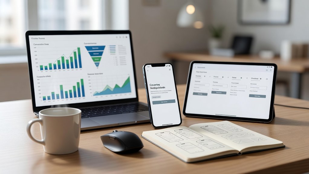
If your website asks visitors to do five different things, most of them won’t do any of them. Pick one primary conversion goal—book a call, start a trial, request a quote, or buy now—and align every page to support it. You’ll measure success faster because you track one North Star metric, not scattered micro-actions.
Use analytics to find your highest-intent path, then remove competing CTAs, links, and forms that dilute clicks. Apply Audience segmentation so each traffic source sees the next best step for its intent level.
Add Content personalization to nudge repeat visitors toward the same goal with smarter defaults (prefilled fields, relevant proof, tailored CTA text). You’re not limiting choice; you’re reducing friction and increasing completion rates.
Fix Your Above-the-Fold Message (Headline + Offer)
Because most visitors decide whether to stay or bounce in under 10 seconds, your above-the-fold message has to do three jobs immediately: name who you help, state the specific outcome you deliver, and make the next step obvious. Treat it like your homepage’s conversion engine.
Lead with headline optimization: use plain language, a tight benefit, and proof-driven specificity (numbers, timeframes, or results). Pair it with a one-sentence subhead that answers “How?” and a single, clear offer (demo, audit, quote, trial).
Your above the fold design should support scanning: strong visual hierarchy, one primary CTA, and zero competing messages.
A/B test headlines, CTA copy, and value props, then keep the winner based on click-through and form-start rate.
Simplify Navigation So Users Don’t Think
After you’ve nailed your above-the-fold message, your navigation needs to get visitors to the next step fast. Limit your top-level menu choices and use clear, specific labels so people don’t pause, guess, or bounce.
Fewer options and plain-language categories reduce friction and push more clicks toward your highest-converting pages.
Limit Menu Choices
When your navigation offers too many choices, you increase cognitive load and users hesitate or bounce—both outcomes drag down conversions. Your job is to remove decisions, not add them, so every click moves visitors closer to action.
Audit your menu design and cap top-level items to the few paths that drive revenue. Use analytics to find the pages that start and finish high-intent journeys, then promote only those routes. If a link gets low clicks or doesn’t assist conversions, demote it to a footer or secondary page.
Group related destinations under a single parent to reduce scanning time and keep user flow tight. After changes, A/B test navigation depth and measure click-through to key pages, form starts, and checkout entries. Iterate weekly.
Use Clear Labels
Fewer menu items only help if people instantly understand what each option leads to, so label your navigation in plain, specific language that matches user intent. Swap vague terms like “Solutions” or “Resources” for outcome-based labels such as “Pricing,” “Book a Demo,” “Case Studies,” or “Support.”
That label clarity cuts hesitation, shortens time-to-click, and increases the odds visitors reach high-converting pages.
Use verbs when the next step matters: “Start Trial” beats “Get Started.” Keep labels consistent with page headlines, ads, and search queries so you reduce cognitive load and bounce risk.
Add brief sublabels or mega-menu descriptions for user guidance on complex sites, but keep them scannable. Then A/B test labels and track click-through to key funnels, not just pageviews, to validate impact.
Improve Page Speed (and Check It Fast)
How fast does your page load on a real mobile connection—and how much revenue are you losing when it doesn’t? Every extra second increases bounce risk and cuts conversions, so treat speed like a sales lever, not a tech chore. Measure first: run PageSpeed Insights and Lighthouse, then confirm with WebPageTest using a 4G profile and a mid-tier phone.
Fix the biggest bottlenecks fast. Start with Image optimization: compress, resize to display dimensions, serve WebP/AVIF, and lazy-load below the fold.
Next, improve server response: enable caching, use a CDN, reduce TTFB by trimming plugins, and upgrade hosting if needed.
Re-test after each change, track Core Web Vitals, and watch checkout and lead-form completion rise.
Add Trust Signals Before Visitors Scroll
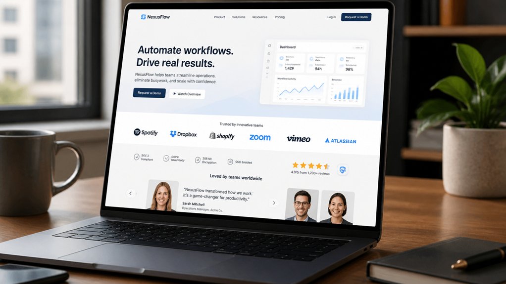
Even if your offer is strong, visitors won’t buy or book if they don’t trust you in the first few seconds. Put proof above the fold so doubt doesn’t win. Add recognizable trust badges near your header, pricing, and forms, and show security seals beside any field that collects payment or personal data.
Back it up with specifics: star ratings with review counts, “as seen in” logos, certifications, and a short guarantee statement. Use real numbers (customers served, years in business, response times) because quantified claims convert better than vague promises.
Keep these elements visible on mobile without pushing key content down. Then verify everything links to a credible source or review platform, so visitors can validate instantly and stay on-page.
Write and Place CTAs That Get Clicks
You won’t get more clicks by asking visitors to “Learn More”—you’ll get them by using clear action verbs that spell out the next step.
Match each CTA to the page’s intent so people see the offer they came for, exactly when they’re ready to act.
Then place CTAs strategically above the fold, near key benefits, and at decision points so you capture momentum instead of losing it.
Craft Clear Action Verbs
On a crowded page, clear action verbs cut decision time and push clicks. Lead your CTA with a strong verb: “Get,” “Start,” “Book,” “Download,” “Claim.” Tests repeatedly show verb-first buttons outperform vague labels like “Submit” because they tell visitors exactly what happens next.
Use actionable language that names the outcome, not the feature: “Get the Checklist” beats “Checklist.” Keep it tight: 2–5 words, one idea, no qualifiers.
Add persuasive phrasing by pairing the verb with a concrete benefit or speed cue: “Start Free Trial,” “Download in 60 Seconds,” “Book a Demo Today.” Avoid jargon and passive constructions.
Maintain consistency: match button text to the headline promise and the form title. Then A/B test verb variants and measure click-through rate, scroll depth, and completion.
Match CTA To Intent
When a visitor’s intent shifts, your CTA has to shift with it—or you’ll bleed clicks. Map each CTA to the job they’re trying to do: learn, compare, validate, or buy.
If they’re early-stage, “See how it works” beats “Buy now.” If they’re evaluating, “Compare plans” or “Calculate ROI” converts better than a generic “Learn more.”
Use analytics to confirm intent signals: entry page, scroll depth, return visits, and pricing-page views. Then apply audience segmentation so first-timers, repeat visitors, and high-intent users see different asks.
Layer in personalization strategies like industry-specific copy, role-based benefits, and dynamic offers tied to referrer or campaign.
Finally, A/B test intent-aligned variants and measure lift in CTR and downstream conversions weekly.
Place CTAs Strategically
Even with the perfect message, a CTA placed in the wrong spot won’t get clicked. Treat call to action placement like a funnel: put primary CTAs where intent peaks—above the fold for high-intent pages, after key proof points for consideration pages, and at the end for readers who need closure.
Use one dominant CTA per screen to reduce choice overload, and repeat it after benefits, testimonials, and pricing to capture micro-commitments. Keep buttons visually distinct, with ample whitespace and high contrast, so they’re scannable in under two seconds.
Drive user engagement by pairing the CTA with a specific outcome (“Get a 2-minute quote”) and minimizing friction with short forms. Then A/B test placement, not just copy.
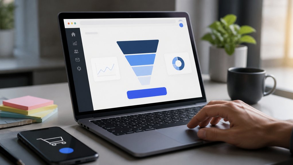
Build 1–2 Clear Conversion Paths per Page
Although your pages may get plenty of traffic, they won’t convert consistently unless you give visitors a clear next step. Limit each page to one primary conversion goal and, at most, one secondary option so attention doesn’t fragment. When you offer three or more competing actions, you increase cognitive load and dilute click-through rates.
Map the page to a single intent: learn, compare, or buy. Then build a straight path: headline that matches the promise, proof blocks that answer objections, and one unmistakable CTA.
Use visual hierarchy to steer eyes—dominant button styling, tight spacing, and directional cues—so the path feels inevitable. Track user engagement with scroll depth, CTA clicks, and exit rates; if drop-offs spike before the CTA, tighten copy or move proof higher.
Shorten Forms to Increase Lead Submissions

Because every extra field adds friction, your form often becomes the biggest conversion leak on an otherwise high-performing page. Audit your form like a funnel: each question must earn its keep. Start with name and email, then test removing phone, company size, and “how did you hear about us.”
Fewer fields typically lifts completions, especially on small screens where thumb-typing drops intent fast—prioritize Mobile optimization with single-column layouts, autofill, and large tap targets. Keep microcopy tight and specific; Content brevity reduces hesitation and errors.
If you need more detail, collect it after submission via progressive profiling or a follow-up email. Add inline validation, clear privacy reassurance, and one CTA. Then A/B test field count and measure submit rate, drop-off, and lead quality weekly.
Use Landing Pages for Ads and Offers
Don’t send paid traffic to your homepage—send it to ad-specific landing pages that match the headline, offer, and intent so you can lift conversion rates and cut cost per lead.
Build offer-driven conversion paths with one clear CTA, minimal distractions, and a message that stays consistent from click to form.
Then A/B test the page by ad group and track CVR and CPL so you can scale what works and pause what doesn’t.
Ad-Specific Landing Pages
Why send paid traffic to a generic homepage when a focused landing page can lift conversions by double digits? Match each ad’s promise to a single landing page that repeats the same headline, imagery, and value prop, so visitors instantly confirm they’re in the right place.
Strip navigation, reduce choices, and keep one primary CTA above the fold to cut drop-off. Use User segmentation to tailor copy, social proof, and FAQs by intent (brand vs. nonbrand, problem-aware vs. solution-aware, geo, device).
Then run disciplined A/B testing on headline, hero, form length, and trust elements; let statistically significant wins guide iteration, not opinions. Track ad-to-page message match, bounce rate, scroll depth, and cost per lead, and pause underperforming variants fast.
Offer-Driven Conversion Paths
Once you’ve nailed ad-to-page message match, the next lever is the offer itself—build landing pages that route each visitor down a clear, offer-driven path based on intent. Create distinct paths for “demo,” “trial,” “quote,” and “download,” and remove competing links so the CTA wins the click.
Use user personalization to swap headlines, proof points, and form length by segment, source, or behavior. Add urgency with limited-time bonuses, but test it: track CVR, CPA, and lead-to-sale rate per offer.
Strengthen customer engagement with micro-commitments—progress bars, 2-step forms, and live chat prompts tied to objections. Then A/B test offer framing (value-first vs. discount-first) and iterate weekly.
Optimize routing rules when intent signals shift to keep performance stable.
Track Conversions With Simple Website Analytics
Even if your site traffic looks strong, you can’t improve revenue until you track which actions people actually take. Set up a simple analytics stack: one tool for pageviews and events, plus conversion goals for key actions like form submits, calls, bookings, and purchases. Tag every campaign link so you can tie results to channels, offers, and landing pages.
Focus on metrics that move money: conversion rate, cost per lead, lead-to-sale rate, and revenue per visit. Monitor user engagement signals—scroll depth, time on page, and repeat visits—to spot friction before prospects drop off.
Use clean data visualization dashboards to review trends weekly, not sporadically. Then cut wasted spend, double down on top sources, and tighten pages that underperform.
Run Small A/B Tests on High-Impact Pages
Your analytics now tell you where visitors drop off and which pages drive leads or sales, so use that data to run small A/B tests on the handful of pages that influence revenue most—your homepage, top landing pages, pricing, and checkout/booking flows.
Start with one variable at a time: headline, CTA copy, button color, form length, or trust badges. Define a primary metric (conversion rate) and a guardrail metric (bounce rate or time on page) to protect user engagement.
Keep a clean visual hierarchy by testing layout changes like above-the-fold value props, spacing, and social proof placement.
Run tests until you hit statistical confidence or a minimum sample size, then ship winners fast. Document results so each iteration compounds revenue gains over time.
Frequently Asked Questions
How Often Should I Update My Website Content to Improve Results?
Update core pages quarterly, blog or resource content weekly, and high-traffic landing pages monthly—then adjust based on performance.
You’ll boost Content freshness and rankings while spotting conversion leaks faster. Use analytics to track sessions, scroll depth, and lead rate; refresh any page that drops 10–20% month over month.
Pair updates with Engagement strategies: add FAQs, new proof, clearer CTAs, and internal links. Test, measure, repeat to lift results.
Do I Need a Blog, or Can Service Pages Be Enough?
You don’t *need* a blog, but you’ll want one if you enjoy turning away leads—kidding (mostly). Service pages can be enough when you nail Service page optimization: clear offers, proof, FAQs, internal links, and strong CTAs.
A blog adds Blog benefits like targeting long-tail searches and building trust; brands often see higher organic traffic when publishing consistently. Do this: optimize services first, then blog monthly to capture intent.
What Should I Budget Monthly for Ongoing Website Maintenance?
Budget $75–$300/month for ongoing website maintenance; $300–$1,000+ if you run e-commerce or heavy integrations.
You’ll cover Hosting costs ($10–$60), backups, uptime monitoring, speed tuning, and Website security (updates, malware scans, firewall).
Set aside time for conversion work: analytics reviews, A/B tests, and content tweaks.
Track leads and form completions monthly, then adjust spend toward what lifts conversions fastest.
How Can I Improve My Website’s SEO Without Hiring an Agency?
You can boost SEO yourself—think of your site as a lighthouse: brighter signals pull in qualified traffic.
Start with Content optimization: target one intent keyword per page, tighten titles/meta, add FAQs, and improve internal links; aim for <2.5s load time.
Track Search Console clicks and top queries weekly.
Use backlink strategies: earn links via guest posts, digital PR, and resource pages.
Then test CTAs and forms to lift conversions.
When Should I Redesign My Site Instead of Making Small Changes?
Redesign your site when small tweaks can’t fix poor user experience, outdated visual design, or falling conversions. If bounce rate stays high, mobile usability scores lag, pages load slowly, or your CMS blocks SEO and content updates, you’ll waste time patching.
Redesign when your offer, audience, or brand shifts, or when tracking shows funnel drop-offs you can’t resolve. Set goals, A/B test key pages, then relaunch fast.
Conclusion
When you pick one conversion goal, you see what to cut. When you sharpen your above-the-fold message, you give visitors a reason to stay. When you simplify navigation and speed up pages, you reduce drop-offs you can measure. When you add trust signals and shorten forms, you lift submissions without more traffic. When you build landing pages, track conversions, and run small A/B tests, you turn guesses into gains—and your site starts working harder for you.