

Table of Contents
Most small business websites lose leads because you don’t make your offer, proof, and next step obvious in the first 5–10 seconds. You use vague headlines, hide contact info, and scatter CTAs, so visitors can’t tell who you serve or what they’ll get. You skip above-the-fold reviews, badges, and guarantees, and you ignore mobile speed and tap targets. You also bury pricing cues, service areas, and NAP details, and your forms ask too much. Keep going to see the fastest fixes.
Key Takeaways
- They hide what they do: vague messaging and jargon stop visitors understanding services within 5–10 seconds.
- Their headlines lack specificity: no clear audience, deliverable, timeframe, or measurable outcome supported by proof.
- They dilute conversions: too many CTAs and hard-to-find phone/email reduce calls, form fills, and bookings.
- They avoid transparency and mobile UX basics: no price anchors, slow load times, tiny tap targets, and hidden CTAs.
- They neglect local SEO and lead capture: inconsistent NAP, unclear service areas, and long forms that increase drop-offs.
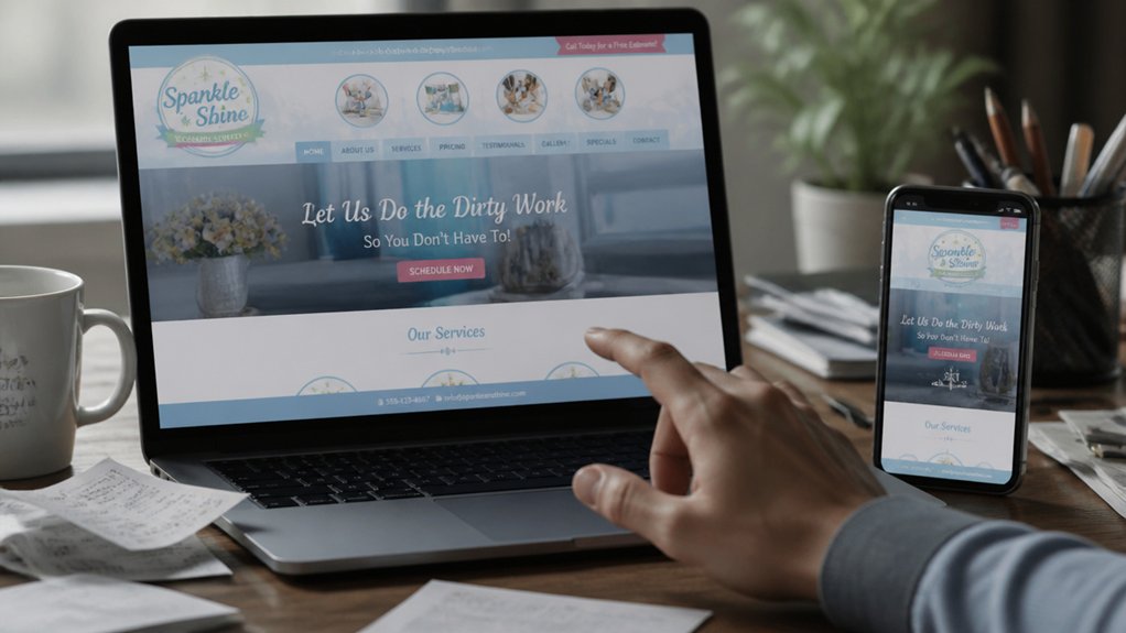
Your Small Business Website Offer Isn’t Clear

If your visitors can’t tell what you do within the first 5–10 seconds, they’ll bounce and buy from someone who makes it obvious.
When your offer is vague (“solutions,” “quality service”), users can’t match your site to their problem, so they exit. Fix it by naming the exact outcome you deliver, who it’s for, and the next step you want them to take.
Audit your top screens: can a new visitor answer “What do you sell?” without scrolling? Cut competing messages, remove jargon, and align every section to one primary offer to improve content clarity.
Keep branding consistency across visuals and tone so people don’t wonder if they’re in the right place.
Then test: track bounce rate, clicks on your main button, and calls.
Write a Homepage Headline That Says Who + What
Although you’ve only got a few seconds to earn a visitor’s attention, a homepage headline that clearly states who you serve + what you deliver can dramatically lift engagement and conversions.
Skip vague slogans and lead with your best-fit customer and measurable outcome: “For local dentists: get 20+ new patient calls/month with SEO.” This instantly reduces bounce risk and helps visitors self-qualify.
Back it with one supporting line that adds proof or differentiator, not Brand storytelling fluff. Use numbers, timeframes, and scope (industry, location, service).
Then validate the promise with Customer testimonials placed nearby, highlighting the same outcome language.
Audit your current headline: can a stranger answer “Is this for me?” and “What do I get?” in five seconds? If not, rewrite until it’s unmistakable.
Put One Primary Call-to-Action Above the Fold
Once your headline makes it instantly clear who you help and what result you deliver, you’ve got to give visitors one obvious next step—right at the top of the page.
Put a single, primary call-to-action button above the fold so it’s visible without scrolling and matches your goal (book, request a quote, start an order). Multiple competing buttons dilute user engagement and increase decision friction.
Choose one action, name it with a benefit (“Get a 15-Minute Plan”), and support it with one line of proof (rating, result, timeframe).
Keep brand consistency: same button color, label style, and tone across pages so visitors learn what to click.
Then measure: track clicks, scroll depth, and conversions, and A/B test copy weekly.
Make Your Phone and Email Impossible to Miss
If visitors can’t spot your phone number or email in under 5 seconds, you’re losing leads to competitors. Put prominent contact info in your header and reinforce it with sticky “Call” and “Email” buttons so it stays visible as users scroll.
You’ll cut friction, capture more high-intent inquiries, and make it easier for customers to choose you now.
Prominent Header Contact Info
Because most visitors decide whether to contact you in seconds, your phone number and email should live in your header—large, clickable, and visible on every page (especially on mobile). That single change boosts contact visibility and reduces friction when intent is high.
Give them header prominence: place phone and email in the top-right (or top row), set 16–18px minimum, and keep contrast strong against the background. Use tap-to-call and tap-to-email links (tel: and mailto:), and label them clearly (“Call” and “Email”), not icons only.
If you track conversions, add event tracking so you’ll see which pages drive calls.
Also display hours and a service-area note near the contact info to pre-qualify leads and cut missed calls fast.
Sticky Call And Email Buttons
While your header contact info does the heavy lifting, sticky “Call” and “Email” buttons keep that option visible the moment a visitor starts scrolling—especially on mobile, where conversion rates often drop when key actions disappear off-screen.
You can increase Call visibility and Email prominence by pinning two high-contrast buttons to the bottom of the viewport. Keep labels literal (“Call,” “Email”), not clever, and make tap targets at least 44px tall.
Link “Call” to a tel: number and “Email” to a mailto: address with a prefilled subject (e.g., “Quote Request”). Track taps as events in GA4 so you’ll know which pages drive leads.
If you’re in a service business, show these buttons on every page except checkout, and A/B test color and copy for lift.
Add Reviews, Badges, and Guarantees Upfront
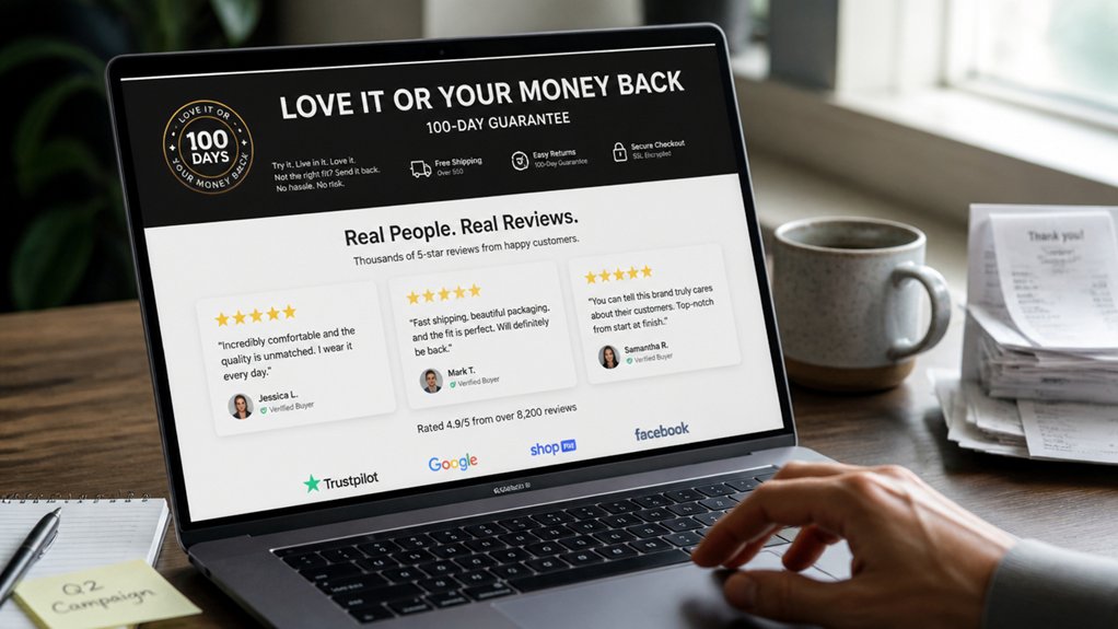
Even before you list features or pricing, visitors decide whether they trust you, so put social proof and risk reducers at the top of the page.
Place 3–5 Customer testimonials above the fold, each with a name, location, and specific outcome to boost credibility fast. Add star ratings and review counts where they’re instantly scannable on mobile.
Next, reinforce safety with trust badges: payment security, licensing, insurance, BBB, industry associations, and verified-review icons. Keep them in one tight row near your primary CTA so they support action, not distract.
Then add a clear guarantee: “On-time or $X off,” “30-day satisfaction,” or “Free rework,” with simple terms.
Finally, link to a full reviews page for depth, but don’t bury proof below the scroll.
Use Real Project Photos (Not Stock)
You’ll convert more local visitors when you showcase real project photos because they prove you can deliver the exact work you’re selling.
Replace stock images with your own job-site shots labeled by neighborhood, and you’ll build trust faster with prospects who want a nearby, reliable team.
Capture clear before-and-after angles (same framing, good lighting) so clients can instantly see measurable improvement and results.
Showcase Authentic Work
Because visitors decide whether to trust you in seconds, your website needs proof—not placeholders—so showcase authentic work with real project photos instead of stock images. Replace generic hero shots with before-and-after images, in-progress photos, and finished results that match the services you sell.
Add short captions that state the problem, your approach, the timeline, and measurable outcomes (cost saved, speed improved, durability increased). This authentic storytelling helps clients picture working with you and reduces uncertainty.
Build a genuine portfolio by grouping projects by service, not by aesthetics, and include 6–12 strong examples per core offering. Use consistent lighting and framing, but don’t over-edit; clarity beats polish.
Ask clients for permission, blur sensitive details, and update monthly so your work stays current and credible.
Build Local Trust
Authentic project shots do more than prove you can do the work—they prove you’ve done it nearby, for people like your next customer. Stock images dilute credibility; real photos raise conversion because they reduce perceived risk.
Add location cues: neighborhood backdrops, recognizable landmarks, branded vehicles, and jobsite signage. Pair each gallery with a one-line note: city, service, and timeframe. Ask permission to include client initials and a short quote to reinforce your local reputation.
Make your photos searchable: name files with city + service, and add alt text that matches how locals search. Post one real project photo monthly on your site and link it to your Google Business Profile to support community engagement and visibility. Track clicks to calls from those pages.
Capture Before-After Details
When prospects can compare a true “before” to a documented “after,” they judge outcomes faster and trust your workmanship more.
Replace stock photos with real, timestamped project shots: wide angle for context, close-ups for finishes, and one “problem detail” photo that explains the scope.
Add one-sentence captions with measurable outcomes (cost saved, time reduced, energy usage improved) and the exact service performed.
Keep branding consistency by using the same lighting style, framing, and watermark across galleries.
Build a clear content hierarchy: lead with the strongest transformation, then process steps, then client quote, then a single call-to-action.
Standardize file names and alt text by location and service to improve local search.
This makes proof skimmable and persuasive.
Make Your Services Scannable in 10 Seconds
If a visitor can’t tell what you do in 10 seconds, you’ll lose them to a competitor who makes it obvious.
Your homepage must answer: who you serve, what you deliver, and the next step—fast.
Use visual hierarchy: one H1 that names your core service, a subhead that states the outcome, then 3–5 service tiles with plain-language labels.
Prioritize content clarity by swapping “solutions” for specific deliverables and adding one proof point per service (time saved, turnaround, compliance, or support window).
Put your primary CTA beside the services list, not buried in a menu.
Test it: show your page to someone for 10 seconds, then ask them to repeat your services.
If they can’t, rewrite headings, reorder sections, and cut jargon.
Show Starting Prices or Clear Price Ranges
If you hide pricing, you force visitors to guess, and that friction raises bounce rates and cuts qualified leads.
Publish starting price anchors and clear price ranges so prospects can self-qualify fast and contact you with realistic budgets.
Pair each range with what’s included, and you’ll reduce low-fit inquiries while improving conversion from your best-fit buyers.
Publish Starting Price Anchors
Why make prospects guess what they’ll pay? When you hide pricing, you increase uncertainty, and uncertain buyers bounce. Use pricing psychology to reduce perceived risk by publishing a “starting at” anchor for your most common engagement.
A clear anchor sets expectations, filters out poor-fit leads, and speeds up decisions—especially on mobile where visitors scan fast.
Apply anchoring strategies: place your starting price beside the primary offer, then tie it to a concrete scope (deliverables, timeline, or minimum commitment). Add one sentence that explains what drives cost up (complexity, volume, urgency) without listing every option.
Track results: compare lead quality, close rate, and sales cycle length before and after. Update the anchor quarterly so it stays credible.
Use Transparent Price Ranges
Although some owners worry that visible pricing will scare people off, transparent price ranges usually do the opposite: they qualify leads faster and reduce drop-offs caused by uncertainty.
When visitors can’t estimate cost, they hesitate, bounce, or flood you with “how much?” emails that drain time.
Add Pricing transparency by showing ranges tied to scope: “Branding packages: $1,500–$4,500,” “Monthly bookkeeping: $300–$900,” or “Web redesigns start at $3,000; typical $5,000–$12,000.”
Pair each range with 2–3 variables that move price (timeline, complexity, integrations) so you keep flexibility while improving cost clarity.
Then add a quick-fit form that routes people into the right tier.
You’ll cut unqualified calls and increase close rates.
Sell Outcomes, Not Website Features
A common mistake on small business websites is leading with a list of features—“mobile-friendly,” “modern design,” “SEO-ready”—instead of the outcomes your customer actually wants. Features don’t buy; results do.
Your visitor’s thinking, “Will this save me time, reduce risk, or make me more money?” Answer that first.
Rewrite your hero section around a measurable promise: “Book 20% more consultations in 60 days” or “Cut quote turnaround from 48 hours to 6.” Then support it with proof: before/after metrics, testimonials tied to outcomes, and a simple next step.
Use Website aesthetics to build trust fast, but anchor every page in what changes for the client. Mention technical optimizations only as enablers: faster lead capture, higher conversion rates, and more qualified calls booked.
Fix Mobile Speed and Tap Targets First
If your site feels slow on a phone, you’re paying for traffic that never reaches your contact form. Mobile users bounce fast: every extra second of load time cuts conversions. Start with speed and tap targets before you tweak copy or colors.
Run PageSpeed Insights and fix the biggest wins: compress images, lazy-load below-the-fold media, remove unused scripts, and enable caching. Aim for under 2.5s LCP and minimal layout shift.
Then audit usability: buttons should be at least 44px, spaced so thumbs don’t mis-tap, and forms should use the right input types. Confirm your responsive design doesn’t hide critical CTAs on small screens.
This mobile optimization work turns the same ad spend and rankings into more calls and booked jobs.
Cover On-Page Local SEO Basics (NAP + Service Areas)
Fast mobile pages only pay off when local customers can actually find—and trust—your business details. Put your exact Name, Address, and Phone in the footer and on your contact page, then match it everywhere. NAP consistency is a top driver of local pack visibility because Google cross-checks your website against Local citations (Google Business Profile, Yelp, Apple Maps, Bing Places).
If one listing shows “St.” and another shows “Street,” you dilute confidence and rankings.
Next, spell out your service areas on key pages: city, neighborhood, and zip codes you actually serve. Don’t hide them in images. Add a dedicated “Service Areas” section and include each area in headings and title tags where relevant. You’ll qualify clicks and cut wasted calls.
Stop Losing Leads With Shorter, Smarter Forms
Because every extra field adds friction, long contact forms quietly bleed leads—so trim yours to the essentials (name, phone/email, and a short “how can we help?”). You’ll usually see higher completion rates without sacrificing lead quality.
Keep form design focused on speed: one column, clear labels, mobile-friendly inputs, and a single, specific CTA.
For lead qualification, don’t force prospects to do your intake work. Use one optional dropdown (service needed) or checkbox set, then qualify with automation: route by selection, trigger a confirmation text, and ask deeper questions after you’ve secured the contact.
Track form completion rate, time-to-submit, and lead-to-booked conversion by field count. Test removing fields before adding any.
A One-Weekend Small Business Website Fix Checklist
While most website overhauls drag on for weeks, you can address the highest-impact issues in a single weekend by focusing on the handful of pages and elements that directly drive calls, form submissions, and booked appointments.
Saturday: audit your top 5 traffic pages in Analytics and map each to one goal; remove distractions, add one primary CTA above the fold, and tighten headlines using Brand storytelling that says who you help and the outcome.
Rewrite service pages around customer personas: pains, proof, pricing range, and next step.
Replace stock photos with 3 real project images and 2 testimonials tied to results.
Sunday: speed-check with PageSpeed; compress images, fix broken links, and ensure click-to-call on mobile.
Then add FAQ, enable form tracking, and A/B test one CTA for 7 days.
Frequently Asked Questions
Do I Need a Blog to Rank Locally, or Is a Few Pages Enough?
You don’t need a blog to rank locally; a few strong pages can be enough. You’ll win local SEO faster with a focused content strategy: one service page per core offer, one location page per city, and a clear contact page.
Add FAQs, reviews, and schema to boost relevance. Publish blog posts only if you can target long-tail queries and keep them updated monthly.
Track calls and form fills.
Which Website Platform Is Best for a Small Business: WordPress, Wix, or Squarespace?
WordPress is usually your best bet—you can’t go wrong if you want maximum Design flexibility and long-term platform scalability.
Choose Wix if you need the fastest DIY launch and can accept tighter SEO and template limits.
Choose Squarespace if you prioritize polished design with minimal upkeep, but expect less extensibility.
Action step: list your next 12-month needs (booking, ecommerce, CRM), then pick the platform that supports them without paid add-ons.
How Often Should I Update My Website Content to Keep It Effective?
Update core pages quarterly, blog or insights monthly, and time-sensitive items (offers, hours, events) immediately. You’ll protect content vibrancy and maximize SEO impact by revitalizing stats, adding FAQs, and improving internal links every 90 days.
Track results: watch impressions, clicks, and conversions in Search Console and Analytics; if performance drops 10–20% month over month, update sooner.
Set a repeating content calendar, and ship small edits weekly.
What Legal Pages Do I Need on My Website (Privacy Policy, Terms, Cookies)?
You need a Privacy Policy, Terms of Service, and a Cookie Policy/banner when you use analytics or ads.
Stat: 81% of consumers say they worry about how companies use their data, so Legal compliance directly impacts trust and conversions.
Publish clear Privacy policies covering data collected, purposes, retention, and user rights (GDPR/CCPA if applicable).
Add terms for payments, refunds, and liability.
Use a cookie consent tool, log consent, and link pages in your footer.
Should I Hire a Professional Designer or Use a Template to Start?
Start with a high-quality template if you need to launch fast and keep costs low.
Hire a professional designer when you need custom visual branding, unique color schemes, or higher conversions.
If you’re pre-revenue, choose a template and spend 2–4 hours customizing fonts, colors, and homepage messaging.
If you’re running paid ads or selling high-ticket services, a designer can lift trust and reduce bounce rates markedly.
Track leads weekly.
Conclusion
Your website shouldn’t be a guessing game—it should be a clear sales path. When you spell out who you help and what you do, add one strong CTA, and make phone/email unmissable, you’ll cut friction that can cost 30–70% of conversions on mobile. Layer in reviews, trust badges, and a simple guarantee, then tighten forms and local SEO (NAP + service areas). Think of it like tuning a race car: small adjustments, faster leads.